CSS filters are great
CSS filters are super cool. They can take something that looks like this…
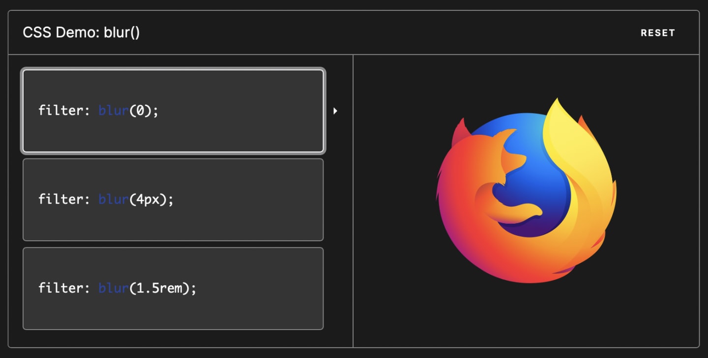
…and make it look like this:

A blurred Firefox logo next to the CSS declaration ‘filter: blur(4px)’.
Love it. Effects like these are the fun part of writing CSS.
And blur() is just one of many fun filter options. The rest are listed here.
CSS filters become especially useful when you want to animate items on and off the page, or in and out of the foreground. For example, you may want to gradually blur items as they animate out. Or gradually blur the page background when a user opens a dialog or modal.
Safari woes
Unfortunately, once you start animating the CSS filter property, you’re going to notice your animation is awfully choppy in Safari.
I ran into this issue at work while animating CSS filters. And I recently heard Scott Tolinski lament on Twitter and the Syntax podcast that he was excited about using CSS filters but was forced to abandon them because of this Safari rendering issue.
But there’s a fix! That’s why I’m writing this post, if only to help Scotty. 😎
The fix
To fix the issue in Safari, take this…
.thing {
  filter: blur(4px);
}
…and change it to this:
.thing {
  filter: blur(4px);
  transform: translateZ(0);
}
That’s it. Your animations will run smoothly in Safari now.
How does translateZ help?
The basic reason translateZ(ANY_VALUE) makes the animations run smoothly is that it tells Safari to render the animation using the GPU instead of the CPU.
Without translateZ() (or a similar hint like translate3d()), Safari will try to animate your filter using the CPU, which isn’t nearly as able to render complicated graphics. For graphics-intensive tasks like animating a filter effect, the GPU will always do a much better job.
Help us out, Safari
Chrome and other non-Safari browsers automatically hardware-accelerate animations like this by engaging the GPU, but Safari still requires you to add specific declarations like translateZ() to get the same result.
Hopefully the Safari team will fix that soon so Scott can animate all the cool CSS features he likes without resorting workarounds like this one.
Until then, translateZ() is your friend.
Related Links
- CSS Filter Effects landing in WebKit — mentions need for
translateZback in 2011 • Chrome Developers - Increase Your Site’s Performance with Hardware-Accelerated CSS • Treehouse
- Improving HTML5 App Performance with GPU Accelerated CSS Transitions • Urban Insight
- CSS GPU Animation: Doing It Right • Smashing Magazine
- Web Performance Fundamentals — calls out that
translateZ()is still needed to get hardware accelerated CSS animations on some platforms • MDN Web Docs - Andy Ngo tweet — suggests
translate3d()version of same trick